Back
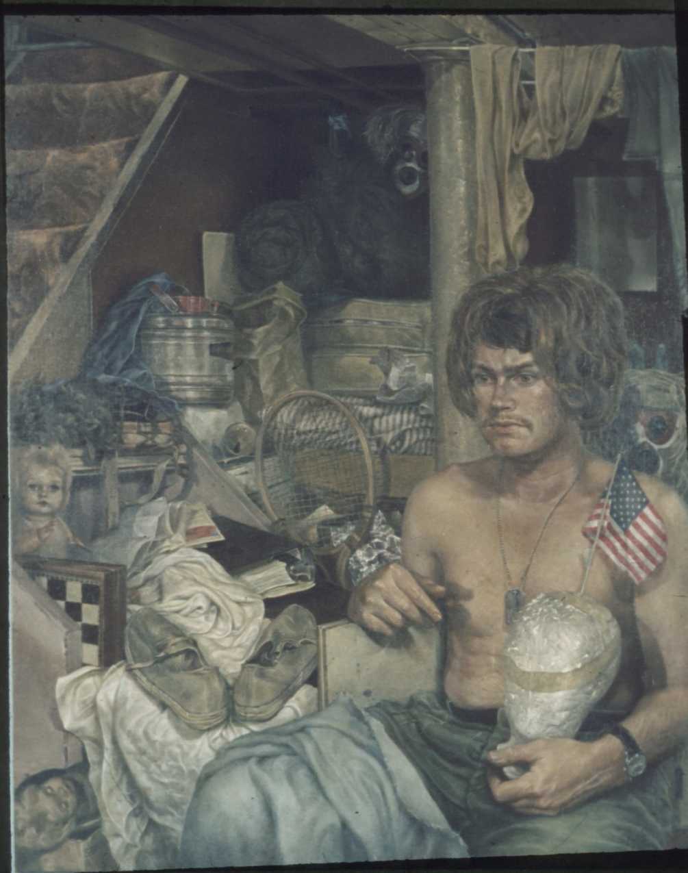
The painting of Triumphal Return by Samizu Matsuki.
Triumphal Return" (1970, Oil on Canvas, 50" by 60") reveals the thousand yard stare of air force, Vietnam veteran Andrew Delaney, back home musing among his childhood relics in the basement of his family home in the Long Island enclave of Rockville Center.
Purposes and techniques involved in the painting of Triumphal Return.
The painting “Triumphal Return” was done in the epoch where the Vietnam conflict was nearing its zenith. The most vocal of all sentiments was that of 'anti-war'. The most immediate experience which inspired my theme was the one where I, by chance, attended the yearly ceremony of the local American Legion, Long Island New York, in which the entire procession was conducted seemingly most diffident and eventlessly hastened up way. The National Anthem was sung in hushed voices in disarray. The white rectangular military caps looked as forlorn as the brown of deserted piers.
There was something moved me deep enough to plunge into my first major work, which the production of demanded total concentration for four months working every night (I painted during night.) Except for Saturday. I went to the movies during the day, to the bar at night for distraction.
Preparation of painting surface was done by mixture of opaque and transparent regular oil color pigments produced by Windsor and Newton and Grumbacher which eventually took the hue of reddish dark brown. I used a commercially prepared cotton small grain canvas. So far acceptable for my rendition of details. On this prepared surface, of approximately 1~2 mm thickness of the pigment after sufficient dryness was achieved, I first transferred the final sketch of the theme using medium strength charcoal of commercial origin.
Approximately 3 or 4 coats of a commercial brand fixative were applied before the execution of final underdrawing (cartoon) by oil colour, mixture of burnt umber and Prussian blue in various composition ratio for the purpose of shortening drying period, with pure turpentine, as medium.
When the under-drawing was sufficiently dry, therefore accepting overlapping pigment application without causing surface damage, I began first application of painting, molding. Medium: pure turpentine plus linseed oil. Ratio, approximately 2 turp/1 linseed. Pigments used were burnt umber, optional Prussian blue and yellow ochre (in later paintings I changed this colour to Naples yellow, because of its larger covering strength and fast drying speed.)
After adequate surface dryness of the so far monochromatic sketched first coat (at this level the entire pictorial plane was equally developed), the second coat was applied to achieve chromatic “mapping” according to the psychological connotation and aesthetic atmosphere desired by the theme.
In this case, I began by using opaque-est possible pigments for the purpose of similar strength such as yellow ochre, cobalt blue, burnt sienna etc, and quick drying properties like umbers, prussian blue, naples yellow mixed by turp and linseed with aforementioned concoction ratio. At this stage the entire effect of the painting still presents monochromatic, relief-like quality, although proper hues were ascribed to the major areas of the composition.
I call it “the view at dusk” for its similarity in chromatic effects.
At this stage the painting surface began to appear “realistic” Since the canvas dimensions of “Triumphal Return” is rather large, 50" by 60", the earlier applications became dry enough to accept further application by the time this coast was finished.
Once this stage is achieved, real part of “painting” begins: rendering of the objects with utmost objective fidelity. The method I used for this purpose was glazing (thin application of transparent pigment) techniques employing pigments of high transparency such as alizarin crimson, ultramarine, prussian blue, verdian green, chrome yellow, aureolin, zinc white, ivory black, etc.
I found later on that the family of “Thalo” had good property for glazing. Especially thalo violet was intriguing in its chameleon-like adaptation to the underlying hues. With same pigment, thalo violet, one can develop several nuances upon surfaces depending on the hues of previous application(s). Thalo family was considered by authority such as Ralph Meyer as comparatively safe but not time tested to the perfect desirability, which might take 500 years to complete. If the surface of “Triumphal Return” crumbles, then the Thalo family of pigments should be buried with it.
When the entire pictorial surface was covered and safely dried, I used larger brushes such as 1inch or 1 1/2 inch flat, sable and fanshaped and or pig hair brushes, employing “wash” technique which is similar to second coating, to go over the entire canvas in order to achieve thematic and pictorial unity*.
This is the final stage of the painting. When the surface becomes adequately dry, regular application of 3~4 coat of “retouch” varnish (I use this frequently to bring out sunk-in colors) was given to the entire pictorial surface. The final varnish using finishing varnish was applied much later. In fact, not until after the exhibition of Triumphal Return in the 1st NY International Art Show was over.
* Pictorial unity: In this case the term is used to connote all the executional aspects utilized for the purpose of constructing pictorial surface."
From a letter to Ronald Huber, March 24, 2007